logo.png)
Best Interior Designers in India: Psychology of Colors in Interior Design 2025
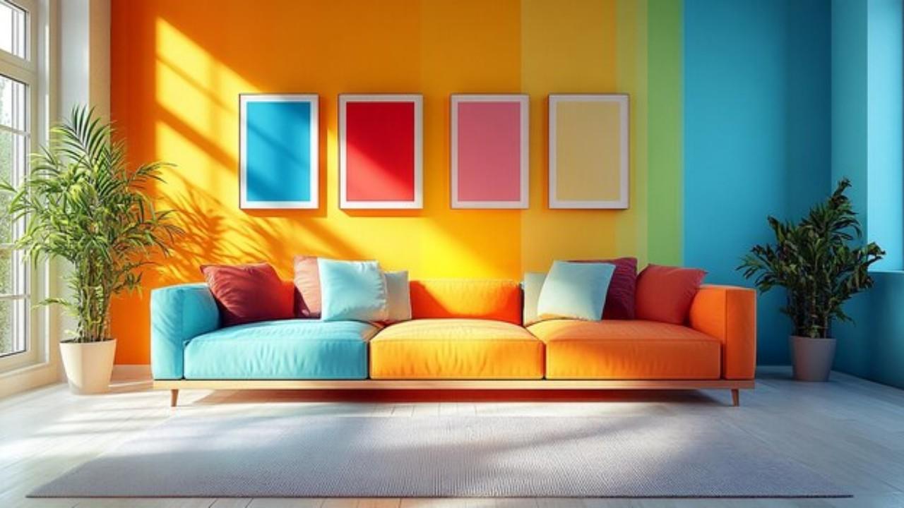
Color is one of the most powerful tools of great interior design. They can change our feelings, mood or even our behavior. Selected a proper color may give a home an intimate, calm, energetic, or rich atmosphere. By 2025, the interior design industry will be prioritizing mental and emotional well-being and how colors can have an effect on them.
Knowing the psychology of colors will help you in choosing the right colors for each room.
Lets dive into each color and how it impacts our psyche and feelings.
Why It’s Worth Knowing Color Psychology in Interior Design?
Each color has a psychological effect on people. But there are some colors that make us feel comfortable and excited, and some that bring peace or rest. Colors impact not just how we feel but also the way we experience space and time. This is the reason it is essential to choose the right color for each one at a room to achieve an attractive place.
How Colors Impact Our Mood
Each color is believed to have a psychological effect. Some colors also create a sense of
tranquility, while others can lend themselves to energy and excitement. Here is a simple
breakdown:
- ➤ Warm colors (red, orange, and yellow):These are energetic, vibrant colors. They are ideal pieces of furniture for social spaces such as lounges and dining rooms.
- ➤ Cool Colors (Blue, Green, and Purple): These colors have calming and soothing effects, which is why they are perfect for use in bedrooms, offices, and meditation spaces.
- ➤ Frensh accents (white, gray, beige, and brown): Neutrals never seem to go out of style, they bring a calming effect to those into colorful interior. They play nicely with both minimal and modern designs.
Best Color Combinations
- ➤ Classic and Timeless: White + Grey + Wooden Accents
- ➤ Cozy and Warm:Beige + Terracotta + Olive Green
- ➤ Refreshing and Light:Soft Blue + White + Natural Textures
- ➤ Elegant and SophisticatedBlack + Gold + Deep Green
- ➤ Modern and Minimalist: Grey + White + Pastel Accents
How The Man Feeling By Each Color Affects The Interior Design
1. Red - Energy and Passion
Psychology of Red:Red is a bold, powerful color that symbolizes energy, passion, and
heat. It accelerates the heart rate, stimulates appetite, and induces a sense of urgency. But
too much red can just make you mad or anxious.
Interior Design Tip: Where To Use Red is an emotionally intense color
- ➤ Ideal for lively conversations in dining rooms, kitchens, and living rooms.
- ➤ You can also introduce red as an accent within pillows, rugs, and wall art.
- ➤ Red may is not the most useful bedroom or study room color, as it can be too stimulating.
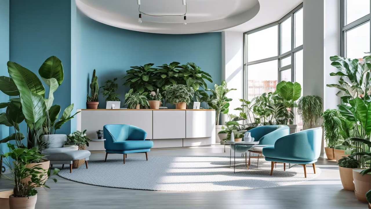
2. Blue: Calmness and Relaxation
Psychology of Blue:Blue is an extremely soothing color. It makes people peaceful,
trustful, and relaxed. Aqua lightens the spirit, while dark blue creates a feeling of gravitas
and sophistication.
Where Blue Works in Interior Design
- ➤ Its for bedrooms, bathrooms, and meditation spaces.
- ➤ Light blue enlarges small spaces.
- ➤ Navy or dark blue adds sophistication to living spaces and offices.
3. Green: Nature and Harmony
Psychology of Green:Green symbolizes nature, balance, and health. It reduces tension and
stress, making it one of the most refreshing and calming colors. Green also enhances
creativity and concentration.
Where to Use Green in Interior Design
- ➤ Ideal for living areas, bedrooms, and offices.
- ➤ Use light green for a new appearance or dark green for a comfortable setting.
- ➤ Plants and green design items add natural attractiveness to the interior.
4. Yellow: Happiness and optimism
The Psychology of Yellow:Yellow represents happiness, vitality, and enthusiasm. It
stimulates the mind, elevates mood, and creates a positive atmosphere. However, too much
yellow might lead to frustration or anxiety.
Where to Use Yellow in Interior Design
- ➤ Suitable for kitchens, dining areas, and playrooms.
- ➤ Use a delicate pastel yellow to provide warmth.
- ➤ Avoid bright yellow in bedrooms since it can be very stimulating.
5. Orange: Warmth and Excitement
Psychology of Orange:Orange combines the intensity of red with the cheerfulness of
yellow. It promotes warmth, excitement, and creativity. Orange is ideal for socializing
places; however, it should be utilized in moderation.
Where to Use Orange in Interior Design
- ➤ Ideal for living rooms, dining spaces, and home gyms.
- ➤ Use in small quantities for accent pillows, wall art, or lamps.
- ➤ Avoid using too much orange in bedrooms and offices.
6. White: Purity and Simplicity
Psychology of White:: White symbolizes purity, cleanliness, and simplicity. It gives a sense
of transparency and makes small areas appear larger. However, too much white might
leave you feeling cold and empty.
Where To Use White in Interior Design
- ➤ Perfect for bedrooms, kitchens, and bathrooms.
- ➤ To enhance warmth, use white with wood or colored accents.
- ➤ Ideal for minimalist and modern houses.
7. Gray: Balance and Sophistication
Psychology of Gray: Gray represents balance, neutrality, and peacefulness. It gives a
trendy, polished appearance. Too much gray, on the other hand, can make things feel
boring or cold.
Where to Use Gray in Interior Design
- ➤ Ideal for living areas, workplaces, and bedrooms.
- ➤ To make it more appealing, combine gray with pastels or metallic elements.
- ➤ Dark gray adds richness, whereas light gray gives a delicate, airy vibe.
8. Black: Power and Elegance
Psychology of Blacks: Black symbolizes strength, luxury, and sophistication. It provides
depth and drama to interiors but should be used carefully because too much black can feel
overwhelming.
Where To Use Black in Interior Design
- ➤ Ideal for accent walls, furniture, and lighting fixtures.
- ➤ Use black in conjunction with white, gold, or wooden textures.
- ➤ Avoid using black in small rooms, as it might make them appear smaller.
9. Pink: Love and Tranquility
Psychology of Pink: Pink represents love, gentleness, and peacefulness. Soft pinks
produce a calming and soothing ambiance, but bolder pinks add a lively element.
Where to Use Pink in Interior Design
- ➤ Ideal for bedrooms, nurseries, and small decorative things.
- ➤ Combine blush pink with white or grey for a gentle, modern effect.
- ➤ Avoid using too much pink in living areas and kitchens.
10. Purple: Luxury and Creativity
Psychology of Purple: Purple symbolizes wealth, creativity, and spirituality. Lighter
tones, such as lavender, are soothing, but deeper shades, such as royal purple, create an air
of richness.
Where to Use Purple in Interior Design
- ➤ Ideal for bedrooms, meditation areas, and accent walls.
- ➤ Use pastel purple to create a soothing atmosphere and dark purple to make a dramatic statement.
- ➤ Combine it with white, grey, or gold for a luxury effect.
11. Brown: Comfort and Stability
Psychology of Brown: Brown symbolizes nature, stability, and comfort. It brings warmth
and earthiness to space.
Where to Use Brown in Interior Design:
- ➤ Perfect for living rooms, dining areas, and offices.
- ➤ Use wood furniture, leather sofas, and tactile rugs.
- ➤ Combine green, white, or beige to create a pleasant atmosphere.
How to Select the Ideal Colors for Your Space
Colors can change the way we feel in a location. Understanding the psychology of colors
might help you make better decisions when designing your house or office.
Here is a quick guide to assist you:
| Color | Mood/Effect | Best For |
|---|---|---|
| Blue | Trust, Productivity | Offices, Study Rooms |
| Green | Refreshing, Peaceful | Gardens, Meditation Spaces |
| Yellow | Optimistic, Warm | Living Rooms, Play Areas |
| White | Minimalist, Spacious | Modern Interiors, Workspaces |
| Black | Luxury, Power | High-End Interiors, Feature Walls |
| Gray | Balanced, Sophisticated | Corporate Offices, Contemporary Homes |
If you are planning your next home renovation, consider colors that not only look good but
also set the proper tone for your room.
If you need expert assistance on interior design , a professional can help you achieve the
ideal combination of color, style, and function. Happy designing!